The problem
Historically, completing a task or 'transaction' with councils has been a lengthy and difficult experience with limited transparency for the user journey.
For customers to access a service through a council or local government organisation, they needed to know who to contact, trawl through pages and documents, search for any appropriate forms, go back-and-forth with customer service or internal staff, and eventually arrive at the part where they can complete the transaction.
This process took a long time, and a lot of resources on both the customer and the staff member's side that could have been spent better elsewhere.
My role
As the Web Specialist for Shoalhaven City Council, I sought to develop a better process that offered more transparency and an improved user experience.
Drawing on my background and experience in both graphic and experience design as well as other fields such as sociology, and my observations of the needs of both internal and external stakeholders, I developed a format for service pages to follow that would assist internal employees in better communicating the user journey and requirements for a successful transaction.
Identifying the core issue
Many local governments transitioned their services from paper forms to web forms without changing the way they structured the forms, not realising that the change in medium could negatively affect the customer's experience of completing the service transaction.
Paper forms generally follow a similar structure to the following:
- Customer details
- Transaction-related details
- Supporting information
- Disclosure statements and signatures
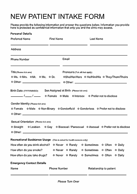
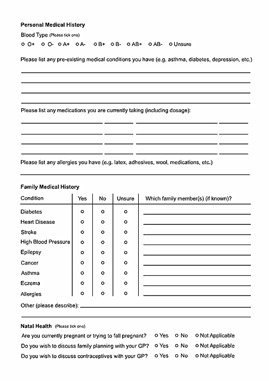
When printed on paper, this format allows the customer to look at each page in advance, letting them scan for any supporting information they may need to photocopy or attach to their submission ahead of time.
However, most webforms are broken into sections which the user must progress through, and often they are blind to the requirements of later sections of the form until they have completed the prior section.
This leads to a problem.
The pain point
Let's examine a very common user scenario - a customer needs to complete a form, and tries to do so while they are on public transit to the city for a day trip. Their documentation related to the form is at home on their desk.
- the customer enters their personal details - minimal effort cost
- the customer enters information about the transaction - potentially requires them to jump between tabs and apps to collate the information, so the effort cost is more significant, but doable
- the customer is asked for supporting information - uh oh
In the event that the customer does not have their documentation with them or has scanned copies or photographs on their phone, they are now prevented from proceeding with the transaction until they get home, which could be hours away.
To make matters worse, by the time the customer is asked for supporting information they may not have on hand, they have already spent a significant amount of effort completing what can potentially be quite a demanding or stressful section of the form (particularly if the form is for a sensitive topic like notifying a council of a deceased estate).
Further compounding the issue, if they accidentally close the tab or the page auto-refreshes due to inactivity, they now have to start over.
This can be a deeply frustrating and irritating experience, and can lead the customer to develop a negative association with the organisation. If the customer is already managing external stressors or the transaction has a tight deadline, they may now be feeling anxiety, stress or even begin to panic.
Because the requirement for supporting documentation was not communicated beforehand, and the customer was not able to view the whole form at a glance to make that assesment for themself, what should have been a simple task now has the potential to ruin the customer's day.
As more and more applications and transactions move to online webforms, it becomes increasingly crucial to prevent these failed transactions by communicating the step zero.
What is 'Step Zero'?
The concept of a 'step zero' is most often associated with addiction studies and treatment programs, as a response to many of the twelve step recovery programs like Alcoholics Anonymous.
The premise is that rather than starting at Step 1 of the program, an individual struggling with an addiction must first realise they are struggling with an addiction in the first place - This step of developing self-awareness and a motivation to change is considered 'step zero'.
Applying this logic to service design, it becomes clear that in order for a customer to complete a transaction process successfully, they must first be aware of the deadlines, limitations and things they will need to have on hand in order to do so.
Defining a service
A service is something an organisation like a local government provides to its customers. Services can be complex and affect many people, like providing waste services across a region, or simple and only affect an individual, like allowing employees to apply for leave.
Services can be for external customers (like residents and commercial businesses) or internal customers (like employees and contractors).
The way that customers access a service, is through a service page.
What is a service page?
A service page is effectively a customer experience tool. How well a service page is designed and written has a direct impact on both the customer's experience in receiving the service, and the employee's experience in delivering the service.
The content of a service page should never assume that the customer knows how to engage with the transaction, it must guide them through the steps they need to take before, during and after.
Lots of application forms, resources, links and documents are added to webpages without context. This sends an unintentional message to the user that they need to 'figure it out' on their own, which sets a bad precedent for that customer's interaction with Council. A service-driven approach helps to avoid sending unintentional messages like this.
However, much like with 12 step addiction treatment programs, a service-driven approach only helps if the customer is adequately prepared to engage with it - This is where step zero comes in.
Designing a service page with step zero principles in mind
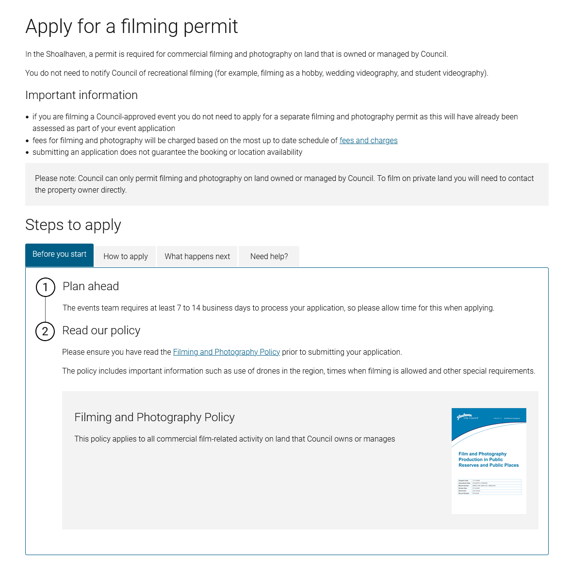
In order to fully communicate the user journey of a service to a customer to give them the best possible chance of a successful transaction, I developed a service page that emphasises the following key components:
- Page title
- Introduction
- Important information
- Before you start
- How to [action]
- What happens next
- Need help?
The page title is the section that the customer will see when searching for the transaction they're looking to complete. These page titles are usually visible on external search engines like Google or Bing, so it's important to capture what the service page is about in a few words.
A good service page title always begins with a verb, and uses simple wording.
The goal: Make the title match the language the customer will use when searching for the page.
This is a brief summary that informs the customer of the purpose of the service, i.e. what it is for, who it is for and what outcome they can expect to achieve by completing the task.
This section is usually fairly brief (a sentence or two is sufficient in most cases) as the majority of the important content will be covered in the following sections.
The goal: Give the customer immediate context for the page they havelanded on so they know if they're in the right place.
This section informs the customer of any key information, such as risks, legal disclaimers, eligibility criteria, limitations, obligations or any other potential issues that might prevent the customer from completing the task.
This information is best presented in a bullet point list so that customers who are skimming the page have the best chance of seeing this information.
The goal: Prevent the customer from wasting time and resources on a transaction they aren't eligible for or may not benefit from.
This is the 'step zero' of the task, and arguably the most important section of the service page.
By being as transparent as possible and outline any steps the customer needs to take BEFORE they sit down to complete this task, this will help to prevent customers from getting halfway through a form and realising they don't have everything they need, and will prevent them from getting frustrated (or panicked if they're completing this last minute).
The goal: Give the customer the resources to make an informed decision about the time and energy they will need to allocate to this task (the 'effort cost') and prevents incomplete submissions that require additional resourcing to complete.
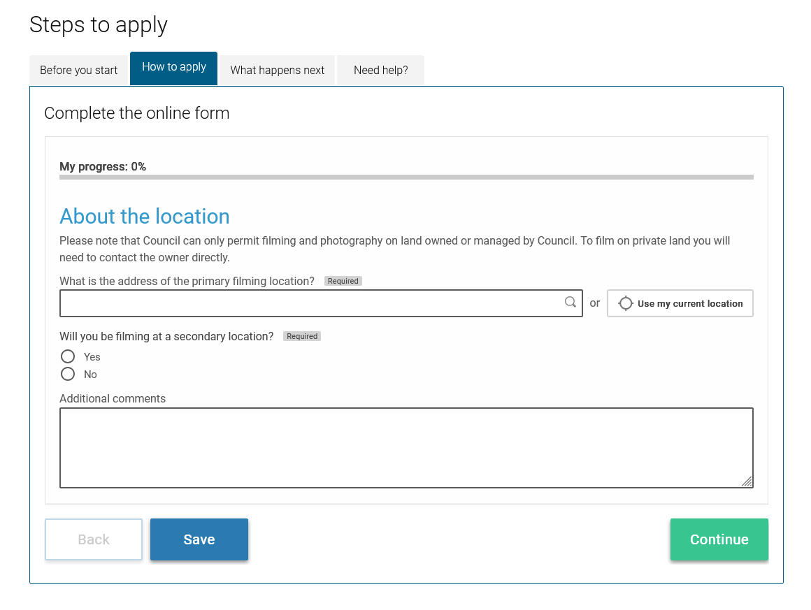
This is where the steps required to complete the transaction are outlined. Ideally the customer will spend as little time on this stage as possible because this is the part where customers are asked to expend the effort cost associated with the transaction.
By providing all of the prior information on the service page, the application form can be kept very simple and lightweight, preventing customers from getting fatigued when completing the form.
The goal: Give the customer clear directions to complete the transaction in the correct way, to give them the best possible chance of a successful transaction.
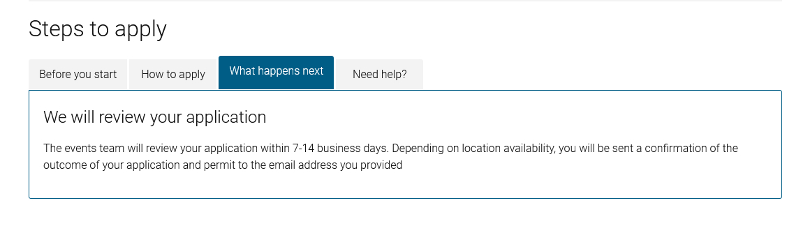
Sets the expectations for the customer for what happens after they hit the submit button by explaining the steps that follow, i.e.
- will they get a confirmation email/sms? - how long will they have to wait for that confirmation?
- how long will it take for a staff member to get to their submission?
- will they need to do anything further after this?
- will they need to pay any fees? - how will they be asked to pay these fees?
- how will they be contacted if more information is needed?
Answering these questions provides the customer with greater transparency into the process, and lets the customer develop an understanding of what is a reasonable amount of time to be patient for, and when they should start worrying about chasing up their transaction.
The goal: Prevent the customer from feeling like they've sent a submission or application off into the aether to potentially never be heard from again, and prevent the customer from calling to seek clarification on the process or chase up a transaction that has yet to be processed.
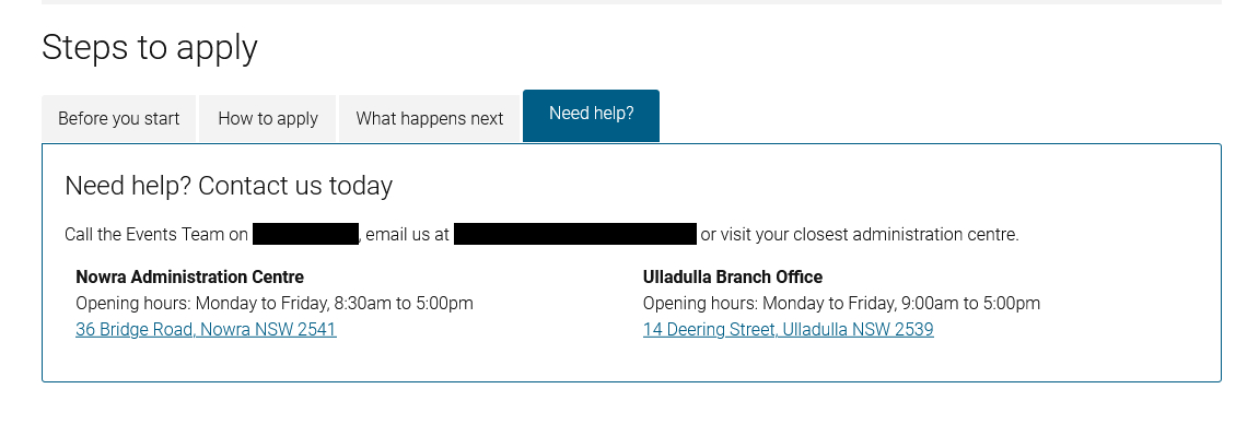
This section is a lifeline for any customers who can't complete the form for any number of reasons, this could include:
- customers with physical disabilities that need help physically completing the form
- customers with cognitive disabilities who need extra guidance or instruction
- customers who speak English as a second, third or fourth language and need translation support
- customers under stress or duress (death of a loved one, domestic violence, risk of homelessness, minority stress, etc.)
- customers with poor internet connection who can't load the form
- customers with limited tech literacy and need extra support to navigate to or through the web page/form
- customers who have encountered a bug that is preventing them from proceeding
- customers with unique circumstances (legal, financial or otherwise) that are preventing them from proceeding
This is also a good place to include links to video tutorials or other agencies that may offer more details or guidance.
The goal: Give the customer an avenue or channel for seeking extra support or guidance, and show the customer that they don't have to figure it out on their own - i.e. that support is there if they need it.
The outcome
Final thoughts
I initially implemented this format on the Shoalhaven Water business unit's website, which reported an almost instant decrease in customer complaints and nearly unanimous positive feedback.
At the time of writing this, I have implemented service pages on the Shoalhaven City Council website, however historically a lot of the information surrounding transactions with this Council has been wholly ommitted from the website, which makes progress and evaluation difficult due to needing to consult with different business units and departments to obtain the information.
The long term goal for the website is to map every transaction with a service page in the services directory, so that no matter what the customer is attempting to do, they can expect a consistent and supportive experience - This will also streamline many sections of the website and prevent double-handling of information, as well as support the customer service department in keeping their scripts consistent with the process.
Unfortunately I won't be able to monitor the long-term success of this format with the Shoalhaven City Council, but the process of designing these service pages has been very rewarding and I hope that the legacy I leave will have a positive and lasting impact on the organisation.